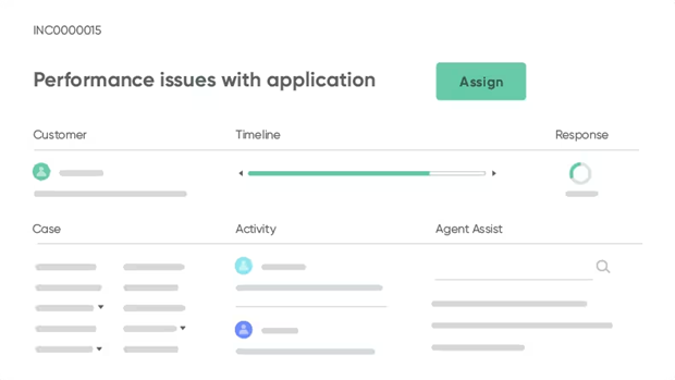
Dynamic dashboards in ServiceNow are more than just a visual representation of data. They are powerful tools that provide real-time insights into business operations, helping organizations make informed decisions swiftly and effectively. With the ability to customize and interact with these dashboards, users can explore data more deeply, gaining a comprehensive understanding of various metrics and their impact on business performance.
The advent of ServiceNow’s dynamic dashboards has revolutionized the way businesses handle data. These dashboards are containers for reports and Performance Analytics visualizations, illustrating the performance of a process or a service. They allow businesses to manipulate and explore data dynamically, boosting user experience and providing valuable insights.
This article aims to guide you through the power of dynamic dashboards in ServiceNow, exploring their importance, how to get started with them, and how to optimize them for better performance.
The Importance of Real-Time Visibility into Business Metrics
Real-time visibility into metrics is not just a luxury; it’s a necessity. The ability to access and analyze data in real time empowers businesses to make informed decisions, respond to trends, and identify opportunities or challenges at the moment they arise.
Real-time data provides a snapshot of your business’s current state, allowing you to monitor performance across different departments and processes. This immediate insight helps organizations identify areas that need improvement or where resources can be better allocated.
Therefore, real-time visibility can significantly enhance customer service. With instant access to customer data, businesses can personalize services, resolve issues promptly, and anticipate customer needs before they arise.
Additionally, having real-time data can improve operational efficiency. It allows businesses to track inventory, manage supply chains, and streamline workflows. By identifying bottlenecks or inefficiencies as they occur, companies can quickly implement corrective measures.
Getting Started
Before diving into the process of creating dynamic dashboards in ServiceNow, it’s crucial to understand the fundamental requirements.
Here are some prerequisites you need to meet:
Familiarity with ServiceNow interface
Understanding the ServiceNow interface is the first step. It’s the platform where you’ll be designing and managing your dashboards.
Access and permissions
You should have appropriate permissions to create and edit dashboards. Usually, this means having an admin role or a specific role assigned to manage dashboards.
Clear objectives
Before starting, define the purpose of your dashboard. What insights do you hope to gain? Who is the audience for these insights? These questions will guide the design and functionality of your dashboard.
Knowledge of data sources
To build meaningful dashboards, you need to know where your data comes from. Whether it’s ServiceNow’s inbuilt modules or integrated external systems, understanding your data sources is critical.
Skills in data visualization
Lastly, basic skills in data visualization are necessary. ServiceNow offers numerous widgets and tools for visualizing data, but knowing how to use them effectively requires some knowledge and experience.
How To Create Your First Dynamic Dashboard
Creating a dynamic dashboard in ServiceNow can be a straightforward process once you understand the basics. Here will go through each step, in order to help you create your first dynamic dashboard:
Accessing the dashboard application
Start by logging into ServiceNow and accessing the dashboard application. You can find this in the navigation pane on the left side of your screen.
Creating a new dashboard
Click on the ‘Create New’ button to start your new dashboard. You’ll be prompted to enter a name and description for your dashboard. Make sure the name is descriptive and aligns with its function.
Adding tabs
Once you’ve created your dashboard, you can add tabs to it. Each tab can represent a different aspect of your data. To add a tab, click on the ‘+ Add Tab’ button, and give it an appropriate name.
Adding widgets
Now, it’s time to add widgets to your tabs. Widgets are the main components of your dashboard that display your data. Click on the ‘Add Widget’ button, and you’ll see a list of available widgets. Choose the one that best suits your data and adds it to your tab.
Configuring the widgets
After adding a widget, you’ll need to configure it. This could involve selecting the data source, defining the conditions, and choosing the fields to display. Each widget will have different configuration options based on its type.
Arranging the widgets
Once you’ve added and configured all your widgets, you can arrange them on your dashboard. Drag and drop the widgets to place them where you want.
Saving and sharing the dashboard
Finally, save your dashboard. If you want other users to access this dashboard, you can share it with them by adjusting the sharing settings.
Integrating Business Metrics into Your Dashboard
Incorporating business metrics into your ServiceNow dashboard is a strategic move that can enhance your decision-making process.
Here’s a step-by-step guide to help you integrate these vital indicators:
Identify key metrics
Start by identifying the key metrics that align with your business goals. These could be financial figures, operational statistics, or customer-related metrics. The key is to choose metrics that provide meaningful insights into your business performance.
Configure data sources
Once you’ve identified your key metrics, the next step is to link the appropriate data sources. ServiceNow allows you to pull data from various modules within the platform or even external systems.
Navigate to ‘Data Sources’ under ‘Reports’ in the left navigation pane and follow the prompts to add your desired data source.
Create or modify widgets
With your data sources in place, create widgets that display these metrics. Remember, each widget should represent a specific metric.
For instance, a pie chart might be suitable for displaying sales breakdown, while a bar graph could visualize monthly revenue trends.
Customize the display
Customize the display of each widget to ensure that the data is easy to understand. This could involve choosing the right colors, adjusting the size of the charts, or adding labels for clarity.
Review and refine
Lastly, regularly review your dashboard and refine it as necessary. As your business evolves, so will your metrics and data needs. Keep your dashboard updated to ensure it continues to provide valuable insights.

Optimizing Your Dashboard for Better Performance
Maximizing the performance of your ServiceNow dashboard can significantly enhance user experience and boost productivity. By streamlining the design, optimizing data requests, and leveraging built-in tools, you can create a dynamic dashboard that delivers top-notch performance and actionable insights.
Simplify widgets
Complex widgets can slow down your dashboard. Aim for simplicity and consider dividing complex data sets into multiple widgets.
Minimize data requests
Each widget makes a data request. Optimize these to reduce load times.
Streamline layout
The layout of your dashboard impacts its performance. Optimize widget size and location for a responsive interface.
Leverage performance analytics
ServiceNow’s Performance Analytics tool provides real-time performance measurements, helping you identify areas for improvement.
Conclusion
Dynamic dashboards in ServiceNow have proven to be transformative assets, reshaping how organizations track performance and make data-driven decisions. By integrating key business metrics and optimizing dashboard performance, businesses can harness real-time insights to drive strategic initiatives.
These dashboards provide an intuitive, visual interface for complex data, simplifying the process of identifying trends and areas needing improvement. With ServiceNow’s Performance Analytics tool, continuous monitoring and enhancement of dashboard performance is made easy.
Make sure to you follow Inclusion Cloud on LinkedIn for more insightful guides and key insights into leveraging technology for business transformation.


